
Signage is a reading problem before it is a design problem
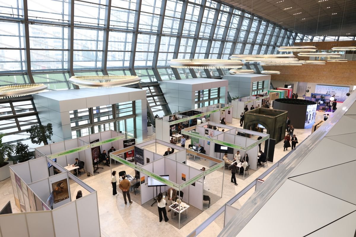
Anyone who has run a booth at a Malaysian trade fair knows the feeling. You spend weeks on the artwork, set up the stand, and then watch visitors walk past without a glance. Usually the design is fine. The problem is that nobody could read it from where they were walking.
People scan a busy hall in a second or two. Text has to be large, short and placed where eyes naturally go, roughly between chest and head height. The Sign Research Foundation publishes studies on legibility and viewing distance that explain why a clean poster on a well-placed stand beats a crowded banner every time.
Choosing stands for the space you actually have
Before ordering anything, measure the footprint you will really get, not the one on the floor plan. Note where power points sit, where the aisle traffic flows and whether there is a pillar in the way. Then decide what each stand needs to do: draw attention, hold brochures, or show prices.
A tall poster stand at the aisle edge pulls people in. A brochure holder works best slightly inside the space, so visitors feel invited rather than ambushed. Looking through a range of poster and brochure stands helps you see the common formats, from A-frame signs to adjustable poles. Stability matters more than people expect. A stand that wobbles when bumped makes the whole booth look temporary.
Think about transport as well. Stands that fold flat and fit in a car boot save a surprising amount of stress on setup day, especially when loading bays are crowded and you only have a short window to unload. Check the weight of each piece if one person will be carrying everything.
For larger events, the Malaysia Convention and Exhibition Bureau lists upcoming exhibitions and venue information, which is useful for planning sizes and logistics months ahead.
Whiteboards for rooms that need to think out loud
Display is only half of the picture. Training rooms, classrooms and project offices need surfaces for working things out in real time. A whiteboard is still the cheapest way to get a group thinking together. The questions are size, surface and mobility.
Magnetic boards let you pin printouts beside handwritten notes. Mobile boards on wheels can move between rooms or turn a corner of an office into a quick meeting area. This whiteboard catalogue page gives a feel for the range of sizes, which helps when you are deciding between one wall-mounted board or two smaller mobile ones.
Surface quality affects ghosting, the faint marks left behind after erasing. Cheaper boards stain faster, so factor cleaning into your choice.
Placement matters too. A board facing a bright window will glare for half the room, and one mounted too high forces shorter presenters to stretch. Stand at the back of the room and check before drilling.
Flip charts still earn their place
In an age of screens, flip charts can look old-fashioned. Facilitators keep using them because they are reliable, need no power and leave a paper record you can stick on the wall. Workshops that move between groups often rely on several charts at once.

If you are setting up a training room, an economy easel-and-pad option covers most everyday needs. Write in large letters, use dark colours, and leave white space so the room can read from the back.
A short set of practical tips on writing, positioning and using flip charts in a session.
Before any event, run through a short checklist: stands and their bases, spare clips, a few blank posters, markers that actually work, a cloth for whiteboards, tape and cable ties. Pack one extra flip chart pad. It always gets used.
After the event, note what visitors stopped to read and what they ignored. That small habit will improve your next layout far more than a bigger budget.
